The project
Sabi is a Latina-owned cold-pressed juice brand based in Southern California. I've worked with the founder over several years as the brand has grown, helping develop its visual identity and carry that look across digital, print and promotional materials.
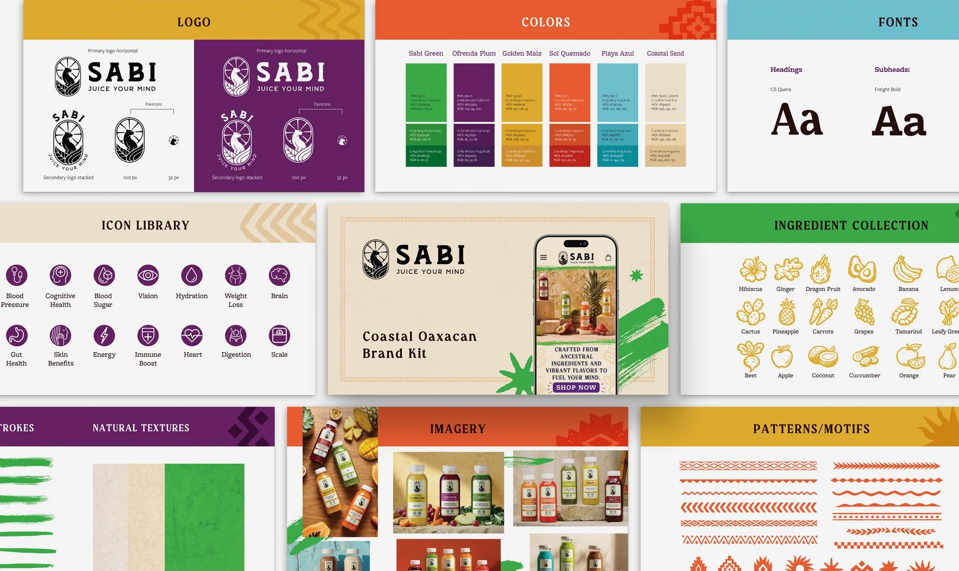
As the brand evolved, we developed a “Coastal Oaxaca” direction that brings together Sabi's Southern California roots with visual influences inspired by Oaxaca and the ingredients and culture behind the products.
The APPROACh
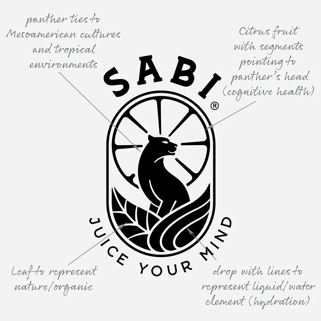
I designed the Sabi logo and later expanded the identity into a larger visual system that could give the brand more personality and flexibility as it grew.
The Coastal Oaxacan direction introduced a brighter color palette, natural textures, hand-drawn ingredients, patterns and graphic elements that could be mixed and matched across different applications.
Bringing it to life
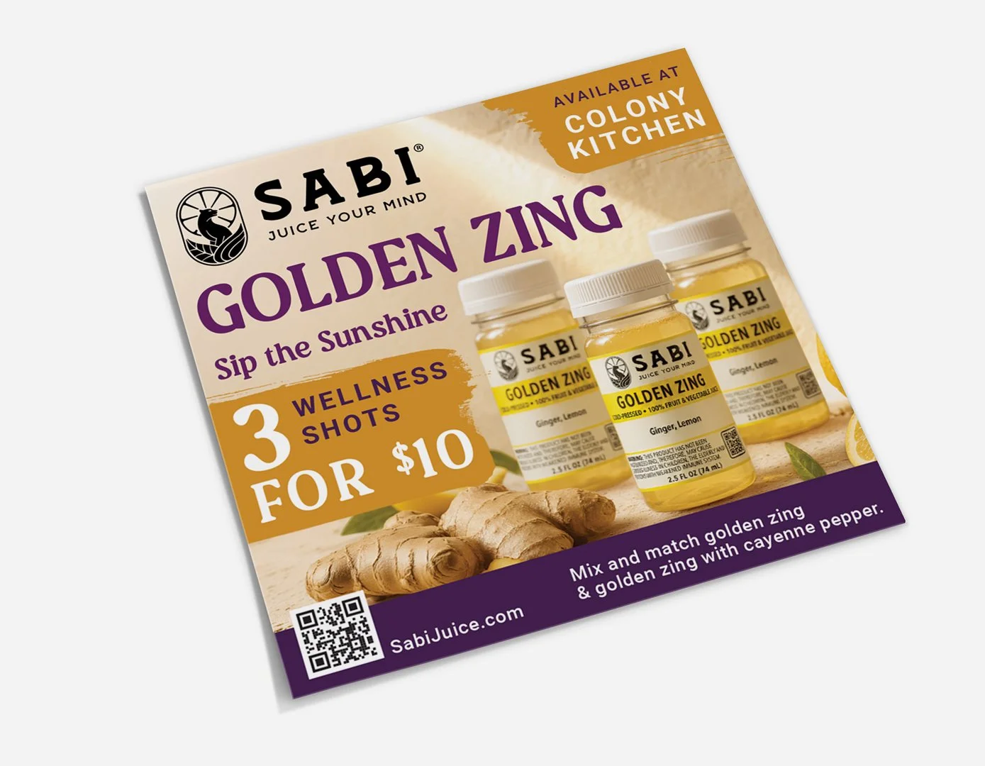
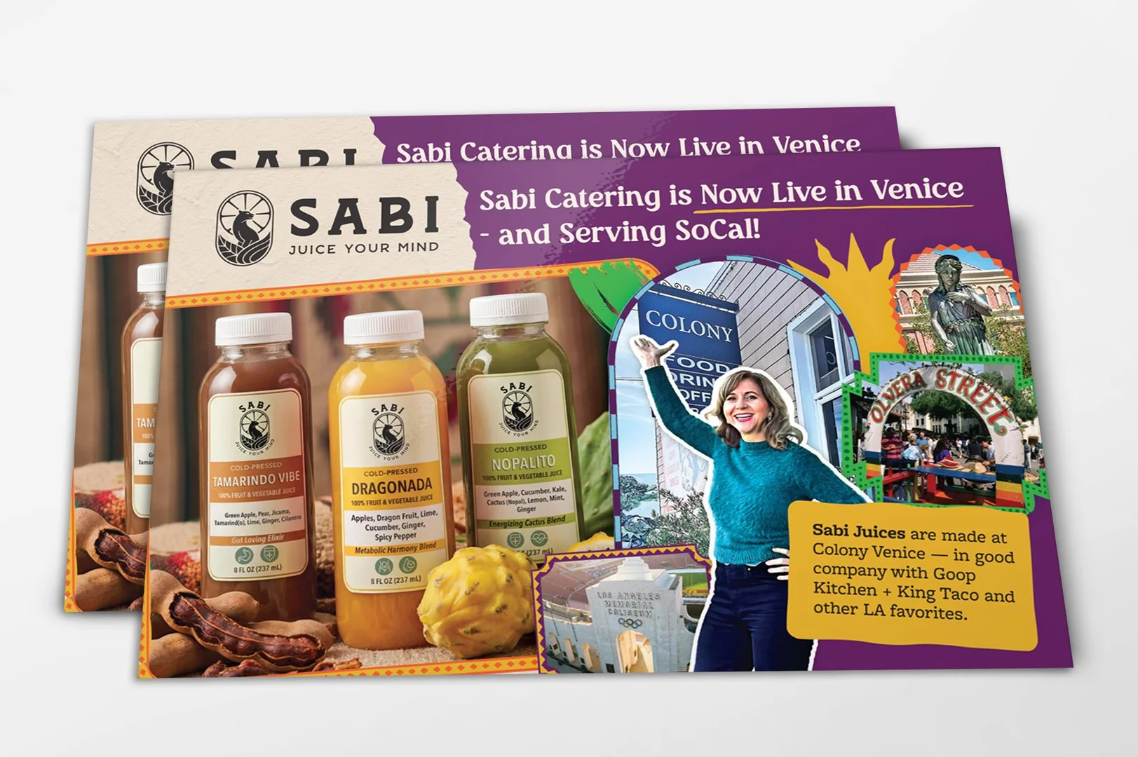
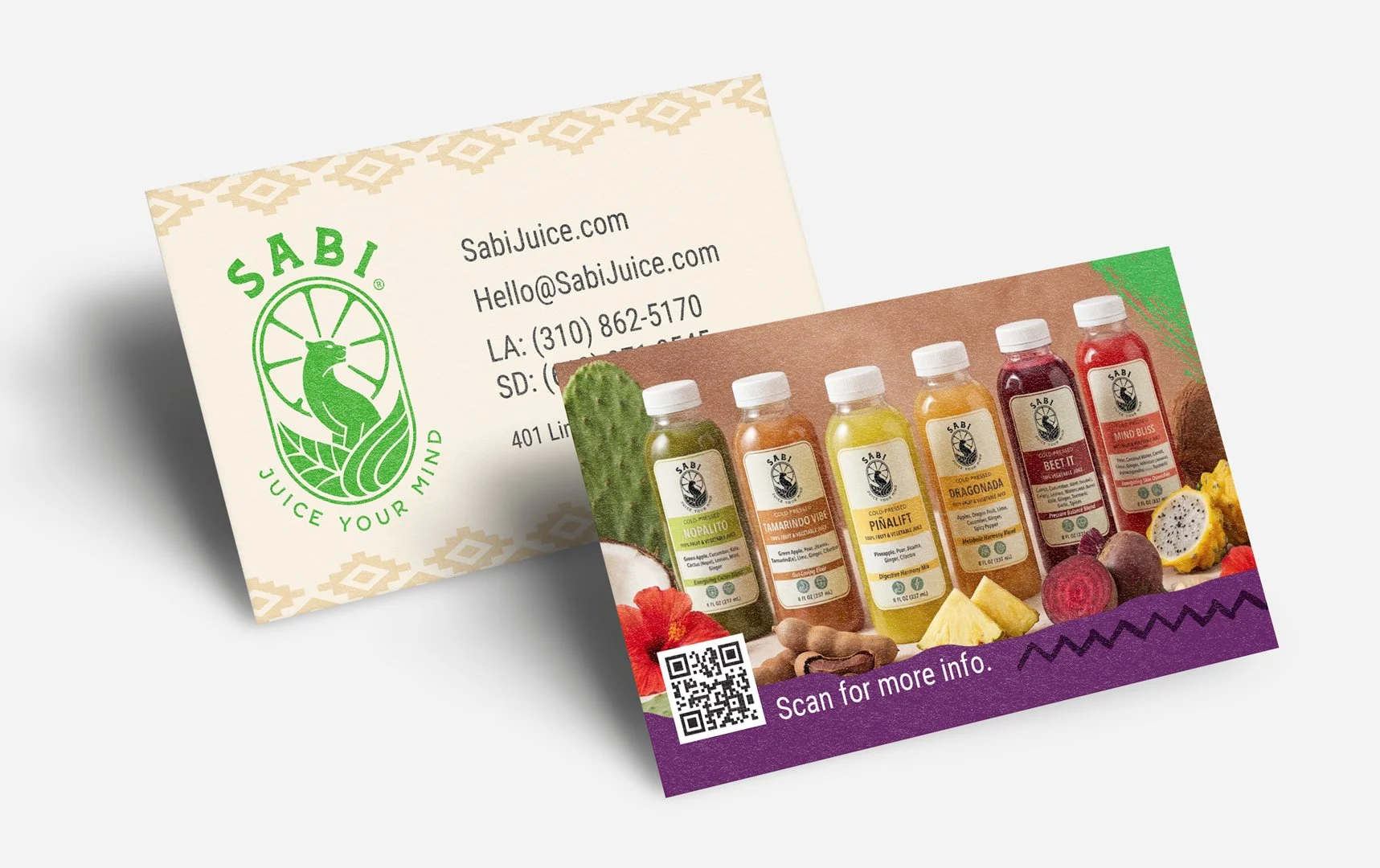
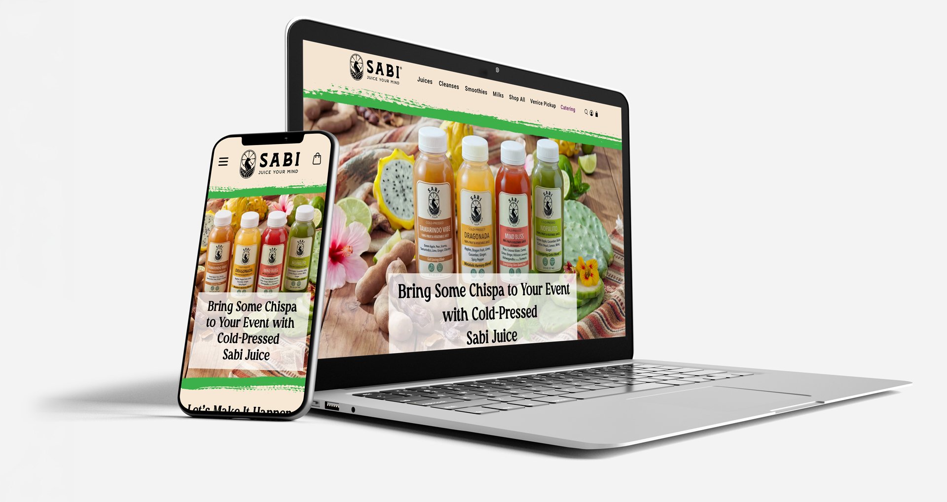
The real test was making sure the new direction could work beyond the brand guide. I began applying the system across Sabi's website, catering experience, product promotions and other customer-facing materials.
Exploring new tools
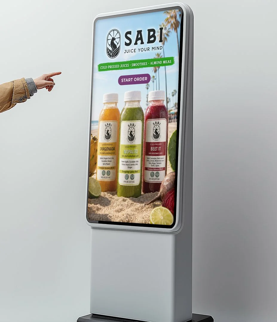
Working with Sabi also gave me an opportunity to start using generative AI as part of my creative process. With limited access to traditional product photography, I experimented with prompting and art direction to create product imagery that matched the Coastal Oaxacan look.
It became a useful way to explore settings, ingredients and compositions that would have been difficult to produce otherwise. The process also taught me that getting a usable image takes more than generating something that looks good—it still needs to feel accurate to the product and work within the larger design.
-
![]()
Promo card
-
![]()
Postcards
-
![]()
Business Cards
-
![]()
Digital Ordering Kiosk