the project
Bob's Pickle Pops is a hydration brand built around an unconventional hero ingredient: pickle juice. Over an ongoing client relationship, I've helped refresh key products and extend the brand across packaging, retail, events and sales materials.
The challenge has been balancing what customers already recognize about Bob's with a more cohesive, energetic visual system built for an increasingly sports- and performance-focused audience.
Refreshing the product line
A major part of my work with Bob's has been refreshing the packaging of its core hydration products. Rather than reinventing the brand, the goal was to retain its recognizable personality while improving hierarchy, consistency and shelf presence.
Pickle Pops - 6 count
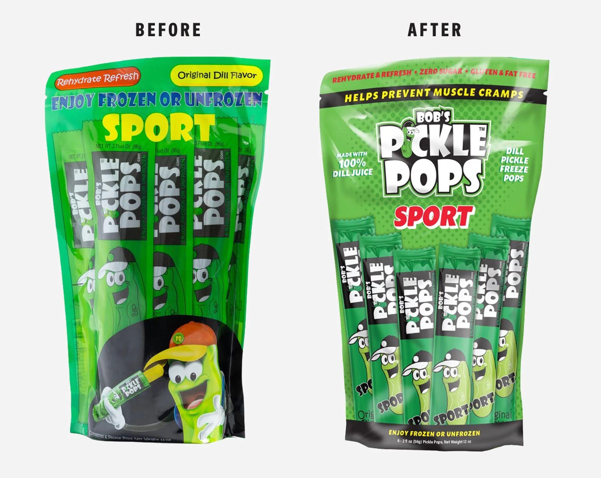
Simplified the package hierarchy and shifted emphasis toward the product name, performance positioning and product visibility.
Pickle Potion 6.3 oz
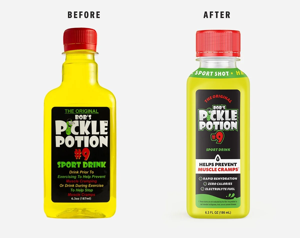
Refined the bottle identity with clearer hierarchy, stronger benefit messaging and a more contemporary sports-hydration presentation.
Pickle Potion+ 3 oz shot
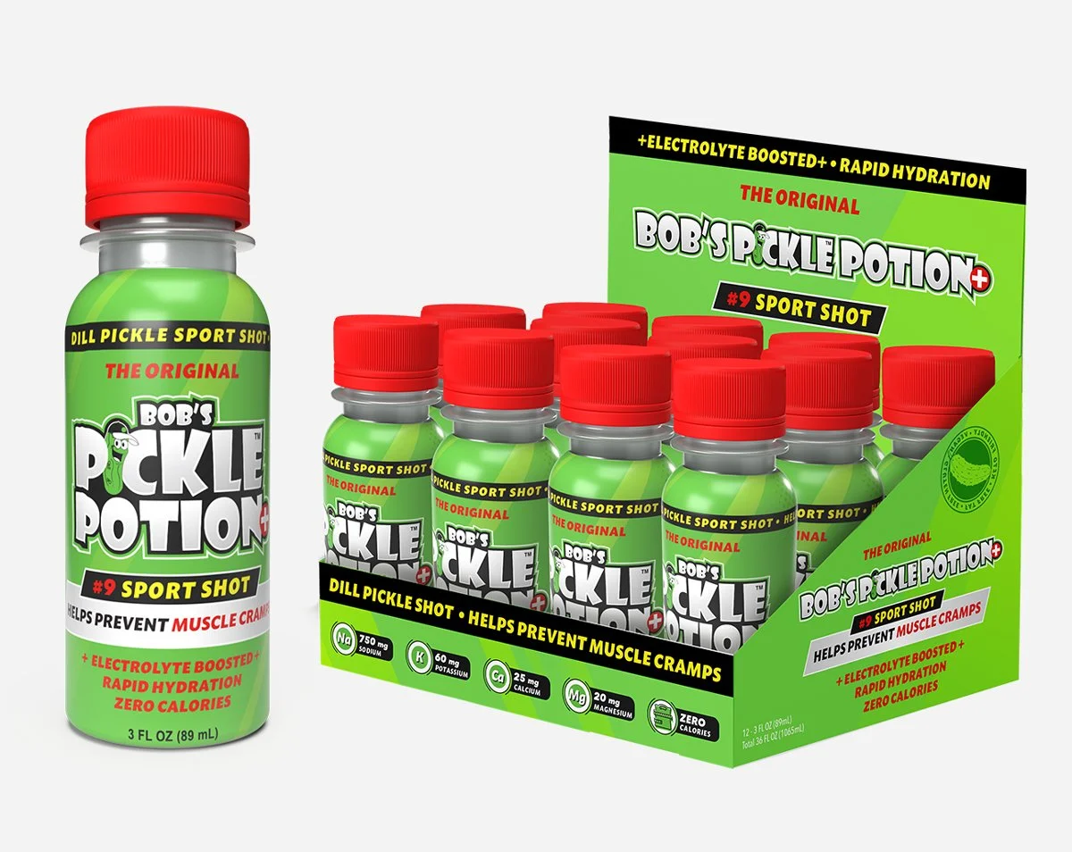
Developed the packaging and retail display for a smaller-format electrolyte shot, extending the visual system into a new product format.
Taking the brand to retail
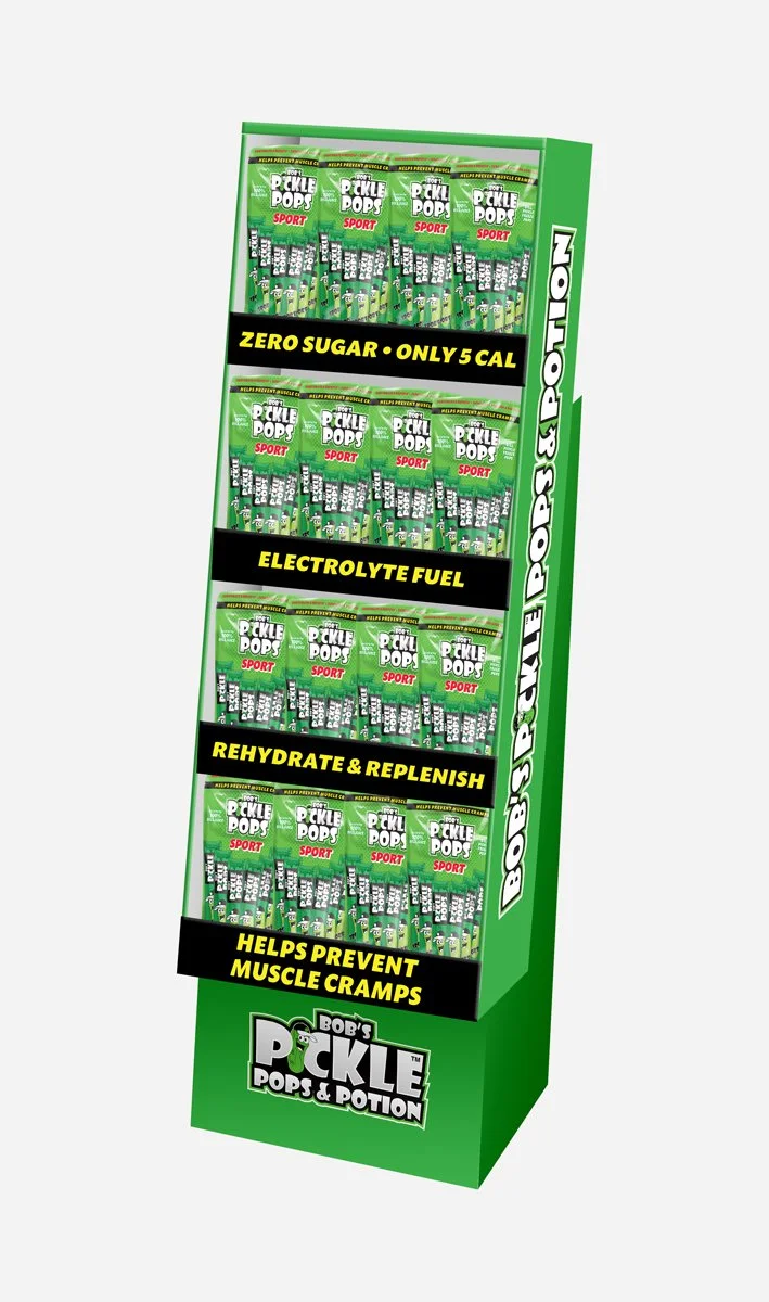
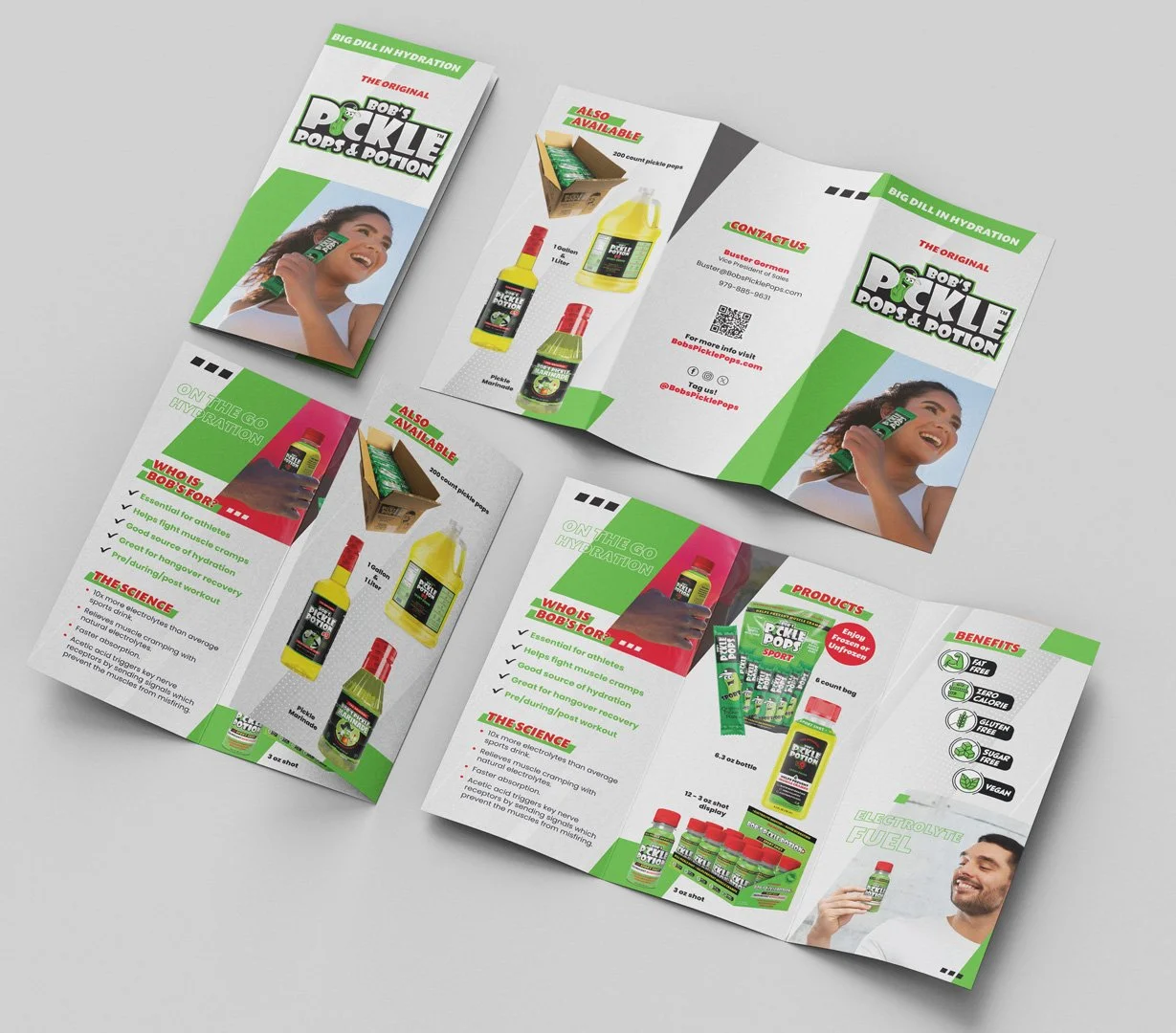
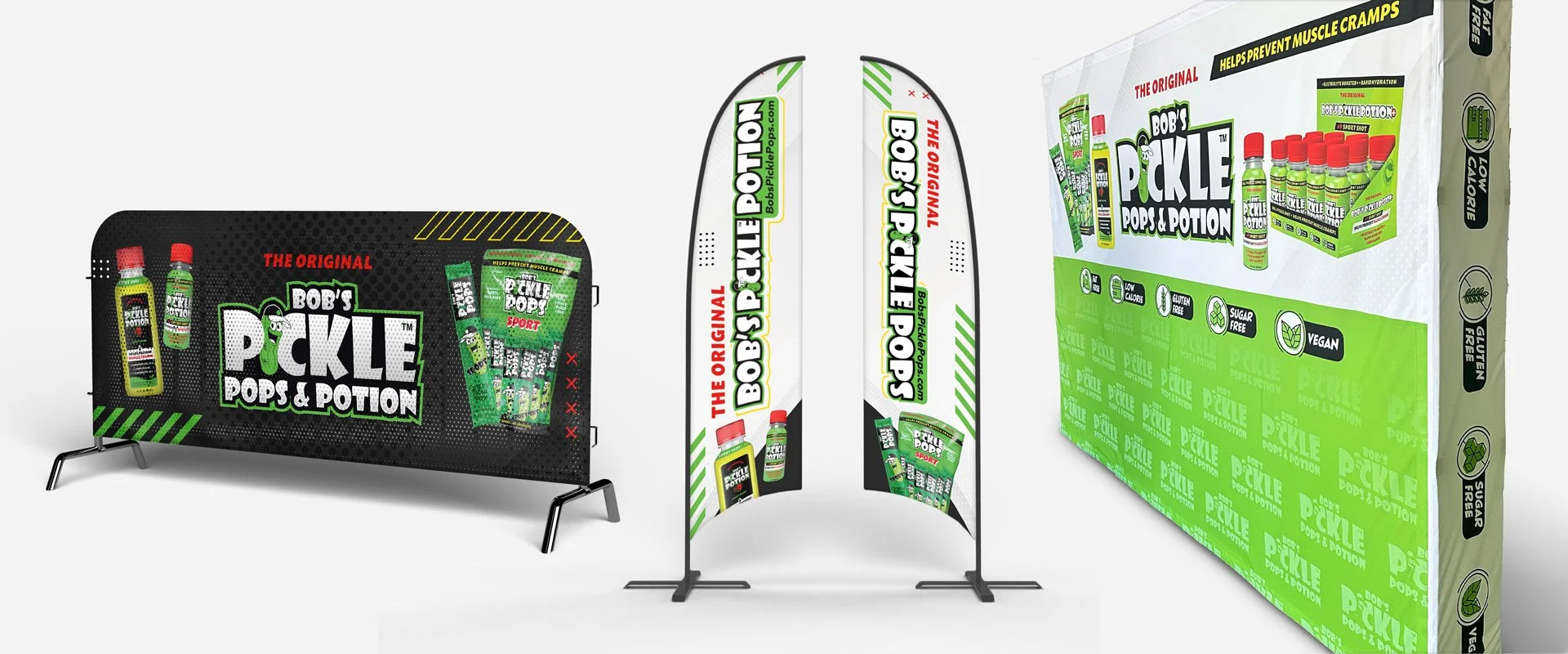
As the product line expanded, the visual system also needed to work beyond individual packages. I carried the refreshed direction into retail displays, sales materials and other touchpoints designed to communicate the product quickly in busy environments.
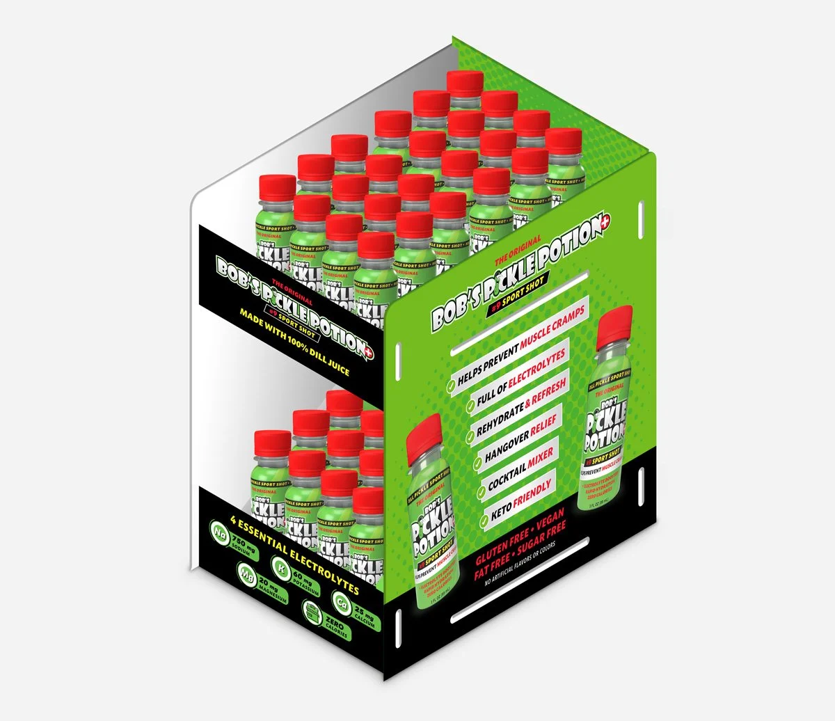
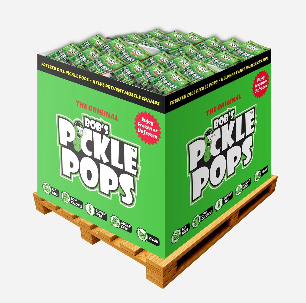
Showing Up in the Real World
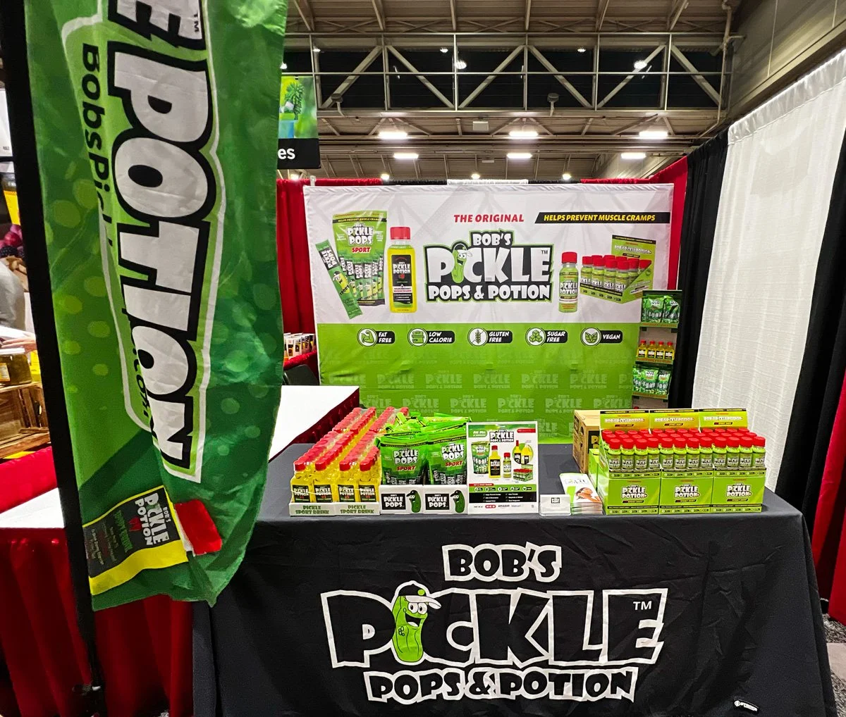
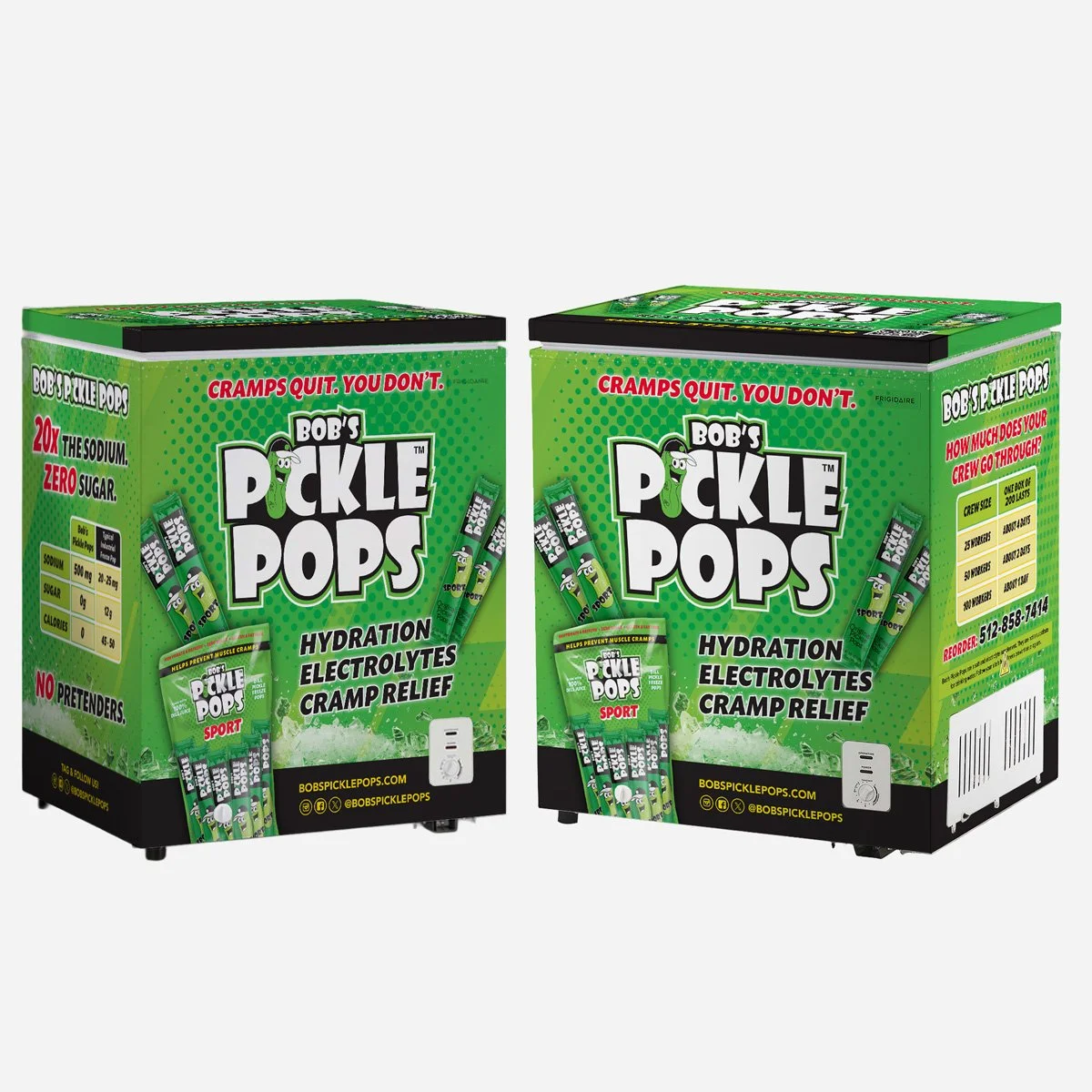
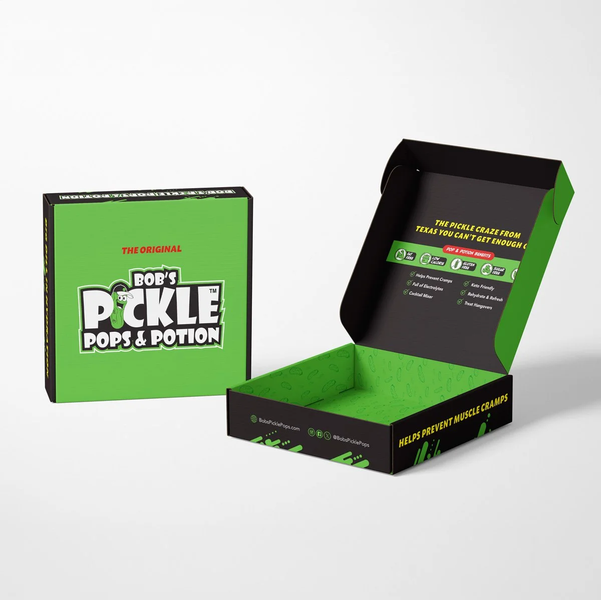
The same system needed to scale far beyond packaging—from retail freezers to athletic events and trade shows. These larger applications pushed the identity to work from a distance while keeping the products and performance messaging immediately recognizable.
-
![]()
Trade Show Booth
-
![]()
Freezer Wrap
-
![]()
Mailing Box
-
![]()
Brochure